
Podcast Guests: Prevent Embarrassing Booking Outreach Emails - Magai AI Prompt Tip
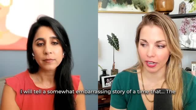
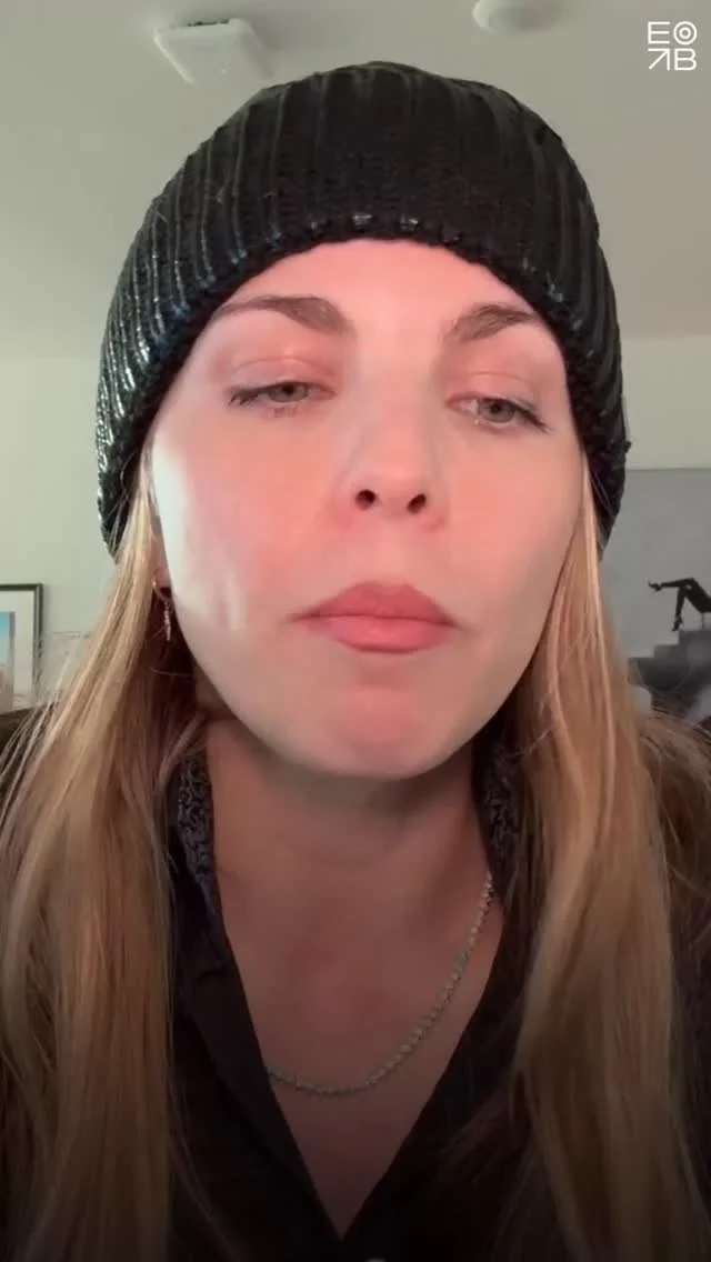
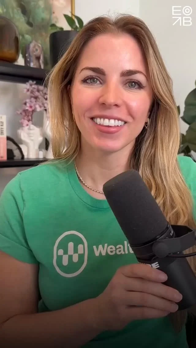
This is one of the most common and avoidable mistakes when trying to get booked as podcast guest. (Watch YouTube Short). So you hired a podcast booking service…
It's wild that even with AI, professionals still hire podcast booking services who send cold emails hoping they find me well and pitching to have their client on my podcast.
I don't have guests on my podcast (Voice Marketing with Emily Binder).
If you listen to an episode for 30 seconds or scan the show notes, that's obvious. My previous, longer podcast (Beetle Moment Marketing Podcast) had guests. But I haven't done that show in three years. And I still get guest inquiries for it.
If my own assistant pitched me as a podcast guest in this sloppy a manner, they wouldn't be my assistant anymore.

Spray-and-pray podcast guest outreach
One small problem: This podcast doesn’t have guests.
Takeaway:
When you have someone dialing for dollars on your behalf without doing table stakes vetting targets, you look lazy and desperate and just... outdated at this point. It looks like you have no budget or discernment and would be happy to guest on any old podcast. It’s Thirsty Marketing (video).
Your salesforce is a reflection of your brand. Any comms that go out on your behalf reflect on you: that is the essence of marketing.
Good news: the tools exist to do better, easily, and they're free. Sure the VA is just $20/hr blasting emails to every podcast out there (even podfaded ones, or single-host ones), but this 'cheap' tactic actually costs you reputationally and wastes time. So it’s expensive in the end because brand value is arguably a business’s greatest asset.
podcast guest target list & email Solution using AI:
If I were in a want-to-be guest’s shoes I'd do this instead.
It will take about ten minutes upfront to generate a strong and detailed output. Save it and re-use.
This prompt works in any generative AI tool but I’m especially loving Magai lately. (It’s another tech rec from my friend Mitch Joel, Founder of ThinkersOne who got me into other must-have tools I use daily like Descript, Hand Mirror, and TextExpander.)
Magai AI
Magai aggregates ALL the top AI tools (LLMs for text and gen AI for images and video). It’s all in a single browser based dashboard and you can save chats. About $15/mo which is a steal. Consider that ChatGPT Plus costs $20/mo as a standalone service. It’s one of many tools included in Magai, for much less. Try Magai

Magai Premium AI Models: ChatGPT, Claude AI, Google Gemini Advanced, Meta Llama, and more! Image Generation: Dall-e 3, Stable Diffusion, Leonardo.ai, Flux, Stable Video…
Steps:
Paste the prompt below.
Fill in your own info in the brackets:
------ begin prompt ------
Lead gen list and email for podcast guest bookings:
"My client [name] is a [industry] expert. [Paste client bio and accolades plus link to their website and link to a strong recent episode on Spotify and if available, YouTube link. Paste a list of five strong or popular episodes they've been a guest on and a short description of each.]
1) Create a list of 20 popular [industry] podcasts that have guests (not solo host shows). Put the podcast name and host name clearly at the top and then link to the podcast home page. Write 1 sentence describing the podcast. Write 1 sentence about why it would benefit my client to be a guest.
2) For each podcast, personalize a short, visibly digestible email about why my client would add value. Do not use platitudes or cliches or "hope you're doing well" type language. Get to the point in the first sentence. Don't sound desperate, sound confident and friendly. Personalize the email by mentioning a recent episode on that podcast which is related to my client's bio (not a random episode). Put 3 bullet points of why my client would be a useful or compelling guest, especially citing stats about their career, business, similar guest appearances, followers, impressions, or dollar amounts of exits / success stats. Offer a 10-minute phone call with my client [insert Calendly link]."
------ end prompt ------
I hope this post finds you well. ;)
Watch more mini-pod clips on YouTube:

How To Add Spotify Podcast Chapters (Clickable Timestamps) - SEO
Adding Spotify Chapters (clickable timestamps) to your podcast show notes is easy and you should do it on every episode. Watch Emily’s tutorial video here.
Read more about the SEO and UX benefits of clickable Spotify timestamps for podcasts here.
Here’s what the clickable kind look like (what you want):
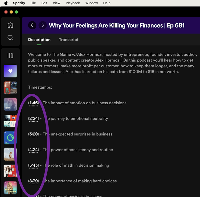
Example Spotify podcast chapters (clickable timestamps) which are great for SEO and UX (user experience). This is “The Game w/Alex Hormozi”, a podcast that figured out the Spotify Chapters trick earlier than most.
Watch video- how to create Spotify podcast chapters:
It’s Like Google Featured Snippets
On Google, Featured Snippets get 35.1% of all clicks. (The boxes featured at the top of search results which answer a specific question.)
Clickable timestamps are like the Featured Snippets of your podcast. They tell listeners and search engines how specific parts of your episode essentially answer a specific question.
Steps: How to add Spotify podcast chapters (linked timestamps):
Using AI or a manual method, generate 8-10 timestamps for every 60 minutes of content.
In your RSS feed host such as Acast, Libsyn, Podbean etc., click to edit the “episode description” (show notes).
Put the timestamps on separate lines beginning with the minutes and seconds, either one or two digits for minutes and two digits for seconds, with a colon in the middle such as 4:34. BUT:
Instead of just writing the time plainly like 4:34, you need to put the time in parentheses to make it clickable in Spotify (a Chapter). Like this: (4:34).
Example of a clickable timestamp / chapter when written in the RSS feed episode description (back-end): (4:34) Investors who lost their password made more money
That’s it. Watch Emily’s tutorial for more details: How To Add Spotify Podcast Chapters / CLICKABLE Timestamps
Related Podcast Tip videos:
Playlist: Podcasting Tips and Gear

This Image Mistake = 267% Less Social Media Engagement. (Marketing Tip Mini-Pod)
Rich media banners are 267% more effective than static banners but this ad stat also applies to engagement on organic social posts (e.g. LinkedIn, X , and Facebook). This mini-pod and blog post is about something small and tactical that has a big impact on your social media efficacy.
Define what we’re talking about:
First, “rich media preview” or metadata just means that the social post’s featured image / thumbnail is grabbing information from your target link (such as a YouTube title and thumbnail, or blog post title and featured image). See the screenshots below with green check marks.
It happens automatically if your linked post or media asset has the metadata (title, thumbnail, description) and you share natively. YouTube always does. Blog posts usually do (up to you in settings).
It happens sometimes when using a scheduling tool like Buffer or Sendible.
It happens sometimes if the person posting chooses to attach a photo instead of letting the URL scrape metadata (native info like image and title). (Don’t attach a plain image when you could let the linked asset’s data scrape in and be rich.)
Benefits of rich media / metadata previews for outbound links on social posts:
Give your audience a more reassuring and visually pleasing UX
Display more information (where they’re clicking to - no surprises)
Use Fitt’s Law: You’ll have a much larger target area (featured visual and clickable description vs one small text URL)

Fitt's Law is a rule that says it's easier to touch or click on bigger things that are closer to you, and harder to touch or click on smaller things that are farther away.
Results: more clicks to your target media. Example below (X post, good):
❌ Vision boards
— Emily Binder (@emilybinder) October 18, 2023
❌ Startup MVPs
❌ 5-year plans
✅ Prototypes
Mini-pod: Why Startup MVPs and Vision Boards Don't Work
Spotify: https://t.co/T7LKM6Xh5t
YouTube: https://t.co/WrxQNn9tii
When it comes to sharing a blog post or YouTube video or article on social, you want the featured / thumbnail image to be rich media, not an attached plain image which forces the user to find the shortlink in the text of the post. That plain image style lowers the engagement rate and likelihood they will click out to your content. Here’s a clip from the podcast explaining more:
Note: this doesn't apply to zero click content, e.g. photo posts where you intend to simply upload pics and not drive traffic to a link - which is fine and intentional.
Example posts: Do This vs. Don't Do This:
A) Do this- Optimal examples:
A rich media experience, clickable featured image with metadata (title, description, target website shown)

Good LinkedIn post style for promoting a YouTube video podcast. First give the audio link (Spotify, Apple, or Podlink / Plink universal podcast menu link. THEN give the YouTube link as the final link because LinkedIn will scrape / feature metadata from the last URL.)
-Twitter example 1 (YouTube clickable preview)

Good X post with YouTube rich media preview - btw this is our client Jonathan Satovsky’s podcast, Wisdom, Wealth, and Wellness - incredible guests like Greg Harden, Bob Roth, Joel Greenblatt- check it out!
-LinkedIn example 1 (YouTube clickable preview)
-LinkedIn example 2 (Two links for podcast audio and video) - Advanced tip: for a post with two links: LinkedIn favors the last URL as the clickable media so if you have a podcast, first put the audio link THEN the YouTube link so people see the more engaging clickable video thumbnail with details. Another good example (do this):

Good post style - LinkedIn: this is a caveat. Zero-click content is meant to let the user get the full scoop without clicking away. Great for photos or videos natively uploaded. Popular lately also: swipe through carousel photo style posts (like mini webinar slides).
B) Don't do this: Not optimal examples:
A jpg or png is attached and that preview image that isn't clickable to open the media. User has to find the link to click inside the post text. Less engaging when seen in a feed.

-LinkedIn example 1 (way too many tags which hurts the post algo if tagged people or companies don't engage, and difficult to visually find the actual target URL)
-LinkedIn example 2 (nice post but image is static and not rich media/clickable to the target URL)
Follow on Instagram: @beetlemoment
Rate / review / subscribe to Voice Marketing with Emily Binder (mini-pod)