"You Don’t Know What You Don’t Know": How Financial Advisors Can Win HNW Prospects
Harvard Business School's Gerald Zaltman reveals that 95% of purchasing decisions are made subconsciously, driven more by emotion than rational thought. Despite this, sales strategies often focus on overwhelming buyers with data, causing decision paralysis.
Our subconscious adeptly processes information using learned experiences, supporting the notion of "trusting your gut." Studies like the Iowa Gambling Task show that emotional intuition identifies patterns faster than rational logic.
For complex sales or considered purchases (such as hiring a wealth manager), appealing to the intuitive mind through storytelling and experiential selling can be more effective than relying solely on facts and figures.
You are advanced enough and honest enough not to be pitching market-beating returns, of course.
But let’s really zero in on the angle that appeals to successful, smart, busy people who know a good deal about investing or have had solid performance but they:
Don’t want to deal with managing a portfolio.
Had a liquidity event or inheritance and find themselves in over their heads.
DIY’d it (perhaps with a robo-advisor) and have 7 figures sitting in Wealthfront or Betterment. (While robo investors can be less desirable FA clients attitude-wise, keep an open mind). This is a legit TAM and a lot of HENRYs hang out there.
Dollar cost averaged into the S&P for fifteen years, and have a chunk of money sitting in Schwab that could benefit from some hygiene, attention, and peace of mind that they’re not overpaying in taxes.
Insights from an actual prospect to RIA client conversion:
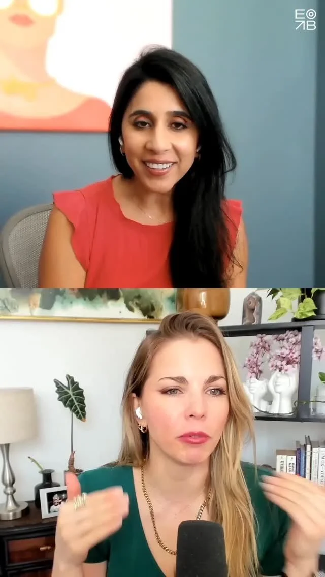
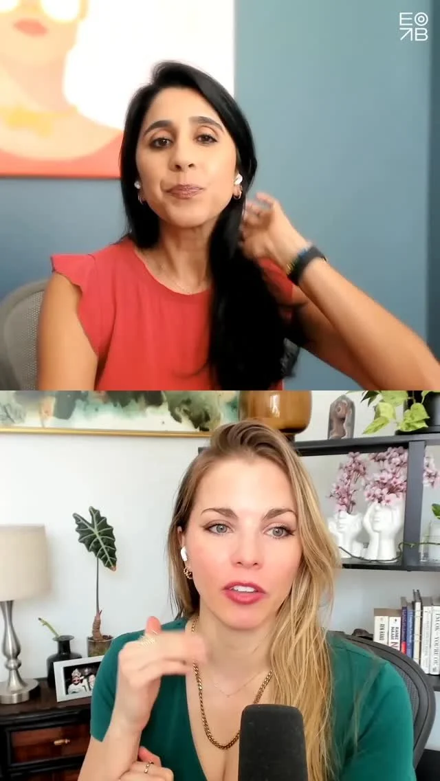
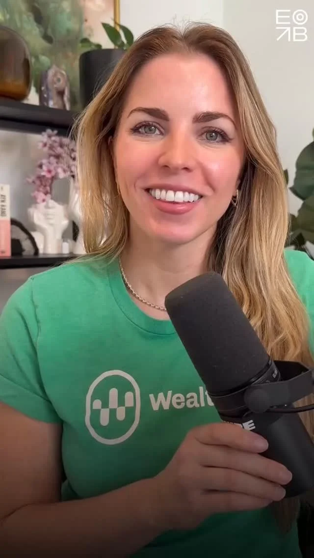
"As a client of an advisor myself, I’m giving you the scoop on why, despite great performance DIY’ing my investments for 15 years, I decided to hire an expert to manage my investments and financial plan.” - Emily Binder
Why I Hired a Financial Advisor
Takeaway: The reduced energy expenditure and peace of mind was worth the fee.
But there’s more nuance to the emotional aspect of this decision.
Positioning your value:
A great messaging strategy speaks to the fact that time (energy) IS money.
It will land well with people who:
value their time (most precious non-renewable resource)
understand the payoff from delegation (business owners especially get this because delegation is a prerequisite for scaling anything)
have intellectual humility and pragmatism about their unpredictable future behavior or lack of detailed knowledge about investing, estate, taxes, retirement, etc.
How do you harness psychology to improve RIA marketing?
Find a way to tactfully show prospects this universal truth:
"You don't know what you don't know."
More on that: The Dunning-Kruger Effect explains how people with limited knowledge often overestimate their expertise. By tactfully addressing this bias, financial advisors can help HNW prospects see the value of delegation and expertise—especially in navigating complex financial decisions they may not even realize they’re unprepared for.
This is an emotional unlock: you are selling peace of mind and time and energy savings. How do you even quantify that? You really can’t. Don’t try. A percentage of AUM is a steal for sleeping well and unemotionally managed diversification.
Sell benefits, not features. Here’s the difference (watch YouTube Short: “Sell benefits, not features.”).
Read more in the blog and video from Emily:
The Time-Freedom Messaging Strategy: 20 Magical Hours
… the greatest benefit you sell but fail to message
Updated August 21, 2025 - from Emily Binder:
Imagine that next month you will receive a bucket of 20 hours in which your mind has zero distractions or worries. You have total quiet and space to dream. Your money is diversified and compounding 24/7, managed by a trusted expert. Your estate is safe. You have enough.
What might you create?
It's not just the 20 hours, it's that your mind is clear and nervous system calm, allowing total blood flow to the frontal lobe. You will come up with new, accretive ideas. Your ideas could create assets, such as a new business or an investment that makes more money from your money while you sleep.
How much would you pay to get those 20 magical hours?
—end pitch—
Your target audience wants those hours. Your service gives them those hours.
Freeing up energy and mental bandwidth is priceless.
~1% AUM becomes perceived as a steal.
Very few wealth managers harness this effectively. It's why you continue having to answer questions about price and fees.
Change the conversation.
I've just given you the general messaging strategy to attract a highly desirable type of client to your advisory business.
We can customize the messaging for your business. Once you have a resonant and distilled message, the hardest part is done. You just platform your message with the right marketing strategy and content. It might simply require a tweak to certain language in your existing content creation.
Click the button below to book a session for Marketing & Brand Strategy (Company).
See testimonials and details about Emily Binder’s advisory sessions at emilybinder.com/call.
Market to One Person, Not a Crowd
Are you marketing to a blur of indistinguishable faces, or to 47-year-old Charlie in Seattle, who’s concerned about finding the right options strategy for his 4000% $NVDA windfall? When you view your audience as a fuzzy crowd, you risk wasting both time and money trying to reach them. Podcast clip:
Get a rifle and narrow your sight. (As you know we write for people who sell considered purchases or services to a discerning audience; not mass market products. If you’re selling Doritos or sedans or iPhone chargers then the shotgun approach may be effective.) More on that:
Rifle vs Shotgun Approach in Marketing (the classic metaphor):
The shotgun approach in marketing aims to reach a broad audience through mass media, generating many leads at a lower cost but often with less precision in targeting. The rifle approach is more strategic, aiming precise content at a narrowly defined group to drive higher-quality engagement and conversions.
mini-podcast: Market to One Person, Not a Crowd
Play on Apple // play on Spotify // or play everywhere else via Podlink.
Content marketing landscape:
Consider the vast amounts of content online along with how much people actually retain:
402.74 million terabytes of data are created each day. (A staggering amount we can't really comprehend.) Source: Exploding Topics, June 2024
The Forgetting Curve: “Some studies suggest that people forget about 50% of new information within an hour of learning it. That goes up to an average of 70% that's forgotten within 24 hours.” Source: Indigene, Understanding the Science Behind Learning Retention
The smart, targeted content creation approach:
If you're creating content in hopes of achieving a business outcome, be thoughtful and specific (use the rifle, not the shotgun):
💬 your message (option: Verb-Your-Noun copywriting framework)
👩🏼🦰 your avatar (target persona, a face)
🛒 your CTA
📈 your goal
Because it's truly a sea at this point. Have a clear picture of exactly who you're marketing to (avatar), whether you’re advertising or doing organic content. You may have two or three avatars; write to one at at time. Make separate content for separate avatars. (Btw, Hubspot is a good tool for segmenting content.) Otherwise you're like the Land Rover Defender and diabetes medication commercials played back to back 242 times in a row over months of re-watching The Sopranos on MAX. (Anecdote explained more on the podcast. Both were a waste of CPM.)
In 2024 we don't need to do the spaghetti at the wall / shotgun thing in marketing, especially not for considered purchases.
More marketing tips / subscribe free:
Podcast home: Voice Marketing with Emily Binder
Follow on Instagram: @beetlemoment
Get email updates (new blogs, one per month max)
Watch more of Emily’s marketing videos and Shorts - YouTube playlist
How To Add Spotify Podcast Chapters (Clickable Timestamps) - SEO
Adding Spotify Chapters (clickable timestamps) to your podcast show notes is easy and you should do it on every episode. Watch Emily’s tutorial video here.
Read more about the SEO and UX benefits of clickable Spotify timestamps for podcasts here.
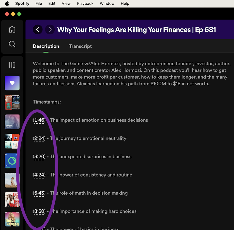
Here’s what the clickable kind look like (what you want):
Example Spotify podcast chapters (clickable timestamps) which are great for SEO and UX (user experience). This is “The Game w/Alex Hormozi”, a podcast that figured out the Spotify Chapters trick earlier than most.
Watch video- how to create Spotify podcast chapters:
It’s Like Google Featured Snippets
On Google, Featured Snippets get 35.1% of all clicks. (The boxes featured at the top of search results which answer a specific question.)
Clickable timestamps are like the Featured Snippets of your podcast. They tell listeners and search engines how specific parts of your episode essentially answer a specific question.
Steps: How to add Spotify podcast chapters (linked timestamps):
Using AI or a manual method, generate 8-10 timestamps for every 60 minutes of content.
In your RSS feed host such as Acast, Libsyn, Podbean etc., click to edit the “episode description” (show notes).
Put the timestamps on separate lines beginning with the minutes and seconds, either one or two digits for minutes and two digits for seconds, with a colon in the middle such as 4:34. BUT:
Instead of just writing the time plainly like 4:34, you need to put the time in parentheses to make it clickable in Spotify (a Chapter). Like this: (4:34).
Example of a clickable timestamp / chapter when written in the RSS feed episode description (back-end): (4:34) Investors who lost their password made more money
That’s it. Watch Emily’s tutorial for more details: How To Add Spotify Podcast Chapters / CLICKABLE Timestamps
Related Podcast Tip videos:
Playlist: Podcasting Tips and Gear
This Image Mistake = 267% Less Social Media Engagement. (Marketing Tip Mini-Pod)
Rich media banners are 267% more effective than static banners but this ad stat also applies to engagement on organic social posts (e.g. LinkedIn, X , and Facebook). This mini-pod and blog post is about something small and tactical that has a big impact on your social media efficacy.
Define what we’re talking about:
First, “rich media preview” or metadata just means that the social post’s featured image / thumbnail is grabbing information from your target link (such as a YouTube title and thumbnail, or blog post title and featured image). See the screenshots below with green check marks.
It happens automatically if your linked post or media asset has the metadata (title, thumbnail, description) and you share natively. YouTube always does. Blog posts usually do (up to you in settings).
It happens sometimes when using a scheduling tool like Buffer or Sendible.
It happens sometimes if the person posting chooses to attach a photo instead of letting the URL scrape metadata (native info like image and title). (Don’t attach a plain image when you could let the linked asset’s data scrape in and be rich.)
Benefits of rich media / metadata previews for outbound links on social posts:
Give your audience a more reassuring and visually pleasing UX
Display more information (where they’re clicking to - no surprises)
Use Fitt’s Law: You’ll have a much larger target area (featured visual and clickable description vs one small text URL)
Fitt's Law is a rule that says it's easier to touch or click on bigger things that are closer to you, and harder to touch or click on smaller things that are farther away.
Results: more clicks to your target media. Example below (X post, good):
❌ Vision boards
— Emily Binder (@emilybinder) October 18, 2023
❌ Startup MVPs
❌ 5-year plans
✅ Prototypes
Mini-pod: Why Startup MVPs and Vision Boards Don't Work
Spotify: https://t.co/T7LKM6Xh5t
YouTube: https://t.co/WrxQNn9tii
When it comes to sharing a blog post or YouTube video or article on social, you want the featured / thumbnail image to be rich media, not an attached plain image which forces the user to find the shortlink in the text of the post. That plain image style lowers the engagement rate and likelihood they will click out to your content. Here’s a clip from the podcast explaining more:
Note: this doesn't apply to zero click content, e.g. photo posts where you intend to simply upload pics and not drive traffic to a link - which is fine and intentional.
Example posts: Do This vs. Don't Do This:
A) Do this- Optimal examples:
A rich media experience, clickable featured image with metadata (title, description, target website shown)
Good LinkedIn post style for promoting a YouTube video podcast. First give the audio link (Spotify, Apple, or Podlink / Plink universal podcast menu link. THEN give the YouTube link as the final link because LinkedIn will scrape / feature metadata from the last URL.)
-Twitter example 1 (YouTube clickable preview)
Good X post with YouTube rich media preview - btw this is our client Jonathan Satovsky’s podcast, Wisdom, Wealth, and Wellness - incredible guests like Greg Harden, Bob Roth, Joel Greenblatt- check it out!
-LinkedIn example 1 (YouTube clickable preview)
-LinkedIn example 2 (Two links for podcast audio and video) - Advanced tip: for a post with two links: LinkedIn favors the last URL as the clickable media so if you have a podcast, first put the audio link THEN the YouTube link so people see the more engaging clickable video thumbnail with details. Another good example (do this):
Good post style - LinkedIn: this is a caveat. Zero-click content is meant to let the user get the full scoop without clicking away. Great for photos or videos natively uploaded. Popular lately also: swipe through carousel photo style posts (like mini webinar slides).
B) Don't do this: Not optimal examples:
A jpg or png is attached and that preview image that isn't clickable to open the media. User has to find the link to click inside the post text. Less engaging when seen in a feed.
-LinkedIn example 1 (way too many tags which hurts the post algo if tagged people or companies don't engage, and difficult to visually find the actual target URL)
-LinkedIn example 2 (nice post but image is static and not rich media/clickable to the target URL)
Follow on Instagram: @beetlemoment
Rate / review / subscribe to Voice Marketing with Emily Binder (mini-pod)
Don't Do Marketing; Be Marketable (5-Minute Video Podcast)
Maybe you’re overcomplicating all of this. So many tactics. So many channels to keep up with.
None of it matters if you’re not marketable. Watch 5-minute video podcast:
Emily Binder’s mini-podcast episode: “Don’t Do Marketing, Be Marketable (Threads dead, baby?)” aired 8/25/2023.
—> 1-click play the audio in your favorite podcast app
Show notes:
Threads burned bright for two weeks then DAU were down over 80%.
Twitter's rebrand to X wiped out ~$4 billion in brand equity. RIP the bird.
Point: All marketing is one of three things:
Branding
PR
Direct response
Everything else is just tactics. This concept from Bob Knorpp is so key.
I go over the #1 marketing mistake I see brands make (this is the "marketable" concept via Samantha Russell).
Success has less to do with tactics like social media or advertising; it's about whether you know why your business exists. Call it a north star, a reason for being. The rest will follow.
Links mentioned:
Follow Samantha Russell on LinkedIn
Bob Knorpp's podcast: The Beancast
Mini-pod YouTube playlist: youtube.com/emilybinder
My favorite podcast tools:
Watch a clip on Instagram | follow @beetlemoment for more
“Voice Marketing with Emily Binder” podcast home page and most popular episodes playlist: emilybinder.com/podcast
Emily Binder's Top Three Podcast Tips (Videos)
Get your podcast or Flash Briefing / WealthVoice Alexa skill up and running with these three must-know starter tips. Voice marketing expert Emily Binder covers the best microphone options for beginners to advanced, the top marketing mistake many podcasters make, and the number one podcast SEO tip.
1) Podcast Microphone: 3 Best Mics (Review)
Get the perfect microphone for your podcast whether you're a beginner or advanced. Emily reviews three great choices (one is free: your phone!). This 7-minute video includes the famous Shure SM7B. Whether you choose Blue Yeti or Shure, ALL the equipment you'll need is linked in the YouTube description or here:
A) Blue Yeti, the top USB mic in the world. The Blue Yeti Amazon Idea List includes:
Blue Yeti USB mic
Boom arm / desk clamp with pop filter
Extra USB cable (have 1 as a backup)
B) Shure SM7B podcast microphone bundle (everything you need).
2) Avoid the #1 Mistake: A Better Way to Share Your Podcast on Social Media
“Don’t make this common mistake when sharing your podcast on social media! Here's a free solution that I use for my podcasts and suggest to all my clients. A universal podcast link. Get your show's 1-click Plink link: https://beetlemoment.com/plink
It’s a single podcast smart link and it will cover your bases for all the major podcast apps. This way you don’t alienate any audience and get the benefit of one simple CTA in your social posts. Sharing your podcast on social media is a key way to grow your audience, so don't make the mistake of sharing only the Apple Podcasts or Spotify or show notes page link!” -Emily
3) Top Podcast SEO Tip: Your Episode Descriptions
“This is my number one tip to get SEO value out of every podcast episode. It's so simple and effective. Google search will scrape keywords but especially outbound links (hyperlinks) that have rich anchor text (keywords that make up the hyperlink).
This means your podcast episodes can outrank blog posts, especially for unique search terms relevant to your brand or business. I show you an example of how my search for ‘onramp invest alexa quick link’ turned up a four-month old Spotify podcast episode I had done where I used similar text in a hyperlink in that episode's description.” - Emily
Subscribe Free to the Mini Podcast: Voice Marketing with Emily Binder
In-Car Voice Assistants and Billboards - What's Next for OOH
Voice assistants in the connected car could be a boon for billboard advertising.
How many people use voice assistants in the car?
Total in-car voice assistant users in the U.S. is almost 130 million with 83.8 million active monthly (as of January 2020).
This total reflects a 13.7% rise in users from September 2018 to January 2020 and is more than 45% higher than the number of smart speaker owners.
About 51% of U.S. adults have used a voice assistant while driving and about one-third have become monthly users. (Via Cerence and Voicebot, 2020)
Are billboards still effective?
37% of drivers report looking at an outdoor ad each or most of the time they pass one (Arbitron National In-Car Study, 2009)
58% learned about an event or restaurant they were interested in attending by viewing a roadside billboard.
Billboard advertising is big money, accounting for $40 billion of global advertising expenditure since 2000 – a figure that is expected to increase by at least 7.6% by 2022.
71% of surveyed individuals in the U.S. recently shared that they feel billboard ads stand out more in comparison to online advertisements
Billboards and Effective Short Messaging
First, remember that billboards should have about five words or less.
What’s next for OOH (Out of Home) and voice marketing?
Billboards whose primary aim is branding probably won’t change much. If they’re a mix of branding and DR that is location based, here’s what could happen. Take McDonald’s for example. Their 2018 Cannes award-winning ad campaign where the Golden Arches were cleverly cropped to create direction arrows is perfect as-is. There’s no reason to add a voice command to the billboard unless it would allow pre-order, faster window pickup, or increase the average cart size (which it could). (Remember, the only reason to use voice is when it makes the customer’s life easier or more convenient — not just to check a box.)
“Follow the Arches” Campaign: McDonald’s Creative Billboard. McDonald’s built these billboards to show drivers the closest restaurants. The Golden Arches were cleverly cropped to create direction arrows. This smart minimalist approach won the Outdoor Grand Prix award at Cannes in 2018.
But for the billboards whose aim is direct response (DR): You’re going to see a change from featuring URLs (and hopefully we’re done wasting four characters on “www.”). It will change to a voice-based hint or command, like, “Ask Alexa to order White Claw.” And Alexa will be accessible in the car. It may be Siri or Google. Or we’ll get to that agnostic point where we have a symbol for “Ask” like we currently realize the @ symbol means it’s a social handle on all networks. Example: “Follow us @beetlemoment” - we don’t need to tell you this means Twitter, Instagram, and LinkedIn - it’s implied. Voice will have that too. Maybe it’ll be a talk bubble symbol instead of the at sign.
Prediction: Within 2-4 years: instead of putting a URL on a billboard, advertisers will display instructions to ask the in-car voice assistant for more information, directions to a location, or to purchase the item right then (perhaps with a discount). This will be done hands-free.
Billboards should have the fewest words possible to convey a simple message that is legible from afar.
Then people will get so used to using voice that the instructions won’t have to be spelled out at all. Over-instructing people would be like saying today, “Pick up your phone and type a search for our brand then tap on the underlined blue text to access the hyperlink.”
In short, effective advertising moves to where people are (i.e. on Instagram, or looking at billboards but using Alexa Auto or Siri / Apple Watch). The ad’s goal is to make it convenient for the audience to understand the message or act. It makes AIDA happen.
Follow @beetlemoment on IG:
Tips: Marketing Your Alexa Skill with a Voice Hub Page - Industry Examples
What should you put on your Alexa Skill landing page or voice experience information page? You have to educate your audience on how to use something new, like an Alexa Skill or Google Action.
Your voice hub page is the perfect place to showcase any voice marketing you’re doing, whether it’s an Alexa Skill, Google Action, Flash Briefing, or podcast.
Why you need a voice hub page:
You’ve heard of the Marketing Rule of Seven: it typically it takes seven exposures to incite a purchase or new behavior in someone. Clear messaging and a single hub page explaining a new service is key to adoption when it comes to new technology like voice.
Imagine you post on social, send an email, tell someone verbally, and then post a few more times on Instagram or Twitter about your Alexa Skill. You will need to “Link in bio!” your audience about seven times til they finally act. Make sure when they do, you have the clear actionable info for them to enable your voice experience or subscribe to your podcast wherever they listen.
Amazon Alexa has about 70% market share for smart speakers and the number one category for requested content is music, news, and weather (including podcasts). Watch Emily Binder’s 60-Second Definition of Voice Marketing
Uber was an early adopter of ordering a rideshare through Alexa. They feature these commands to educate users on how to get a ride using Alexa.
We rounded up several good examples of voice hub pages from different industries. These should inspire you to create your own page that serves as a home for your voice app(s) whether it’s an Alexa Skill, Google Action, both, or other. Whatever you have going on related to smart speakers and/or podcasts or flash briefings, you need a hub page. You should throw your podcast subscribe widget in there too (like right below). If you want a tool to make sharing your podcast easy and 1-click, check out Plink.
We picked pages that make it clear to a new user how to access and use the voice experience. They don’t have to be super stylized or complex. Simple works.
Key components of your voice marketing hub page:
Clear buttons to enable the voice app (links are good too, but make sure you include a colored button with a 1-3 word CTA that the eye is drawn to, such as “Enable on Alexa”)
Feature your Alexa Quick Link for 1-click skill enablement from any device (example: Plancorp Perspective - Alexa Quick Link)
Sample commands or phrases to navigate the voice app, such as “Alexa, ask Onramp Invest for the latest update.”
Pleasing graphics (smart speaker stock photography or branded graphics using non-photograph imagery)
Bonus tip: Create and embed a Spotify playlist of your or your team’s podcast appearances: watch video below to learn how.
Example Spotify podcast playlist embedded:
Learn how to create and embed a Spotify podcast playlist to promote your content:
This is such an underutilized marketing tool!
Alexa Skill or Voice Hub Page Examples - Inspo
🍕 Food/QSR:
Domino's Anyware hub page
Grubhub Alexa Skill hub page
💸 Financial services:
Plancorp, an RIA (Registered Investment Advisor) with over $4 billion AUM (assets under management) built their custom Alexa Skill with WealthVoice. Plancorp Perspective’s voice hub page makes it easy for clients to enable the skill with their Alexa Quick Link. Suggested commands make it easy for clients to interact with their voice experience and get hands-free updates.
💄Beauty:
📰 News:
NPR: Listening to NPR with Alexa
Featuring this handy PDF of phrases - you should consider creating one like this
Note on language: In online marketing, a landing page, sometimes known as a "lead capture page", "single property page", "static page" or a "destination page", is a single web page that appears in response to clicking on an organic search result, marketing promotion, marketing email, or an online ad. What you want to create is a regular page on your website, but we know people often call these “landing pages” so that’s why it’s in the title. You get it.
How to create your own Alexa Skill and send hands-free updates:
Want to create a custom branded Alexa Skill like this and send your audience voice updates anytime? Request an invite to WealthVoice. It’s a voice CMS (content management system) and we can build skills for any industry. It’s like Wix or Squarespace, but for Alexa skills. Watch demo video.
Learn more about our voice marketing and podcasting services:
Get briefed!
Five minutes, twice a week. Subscribe free for marketing and business updates on Voice Marketing with Emily Binder. It’s a mini-podcast and an Alexa Flash Briefing.
